Client
–


–
–
2019
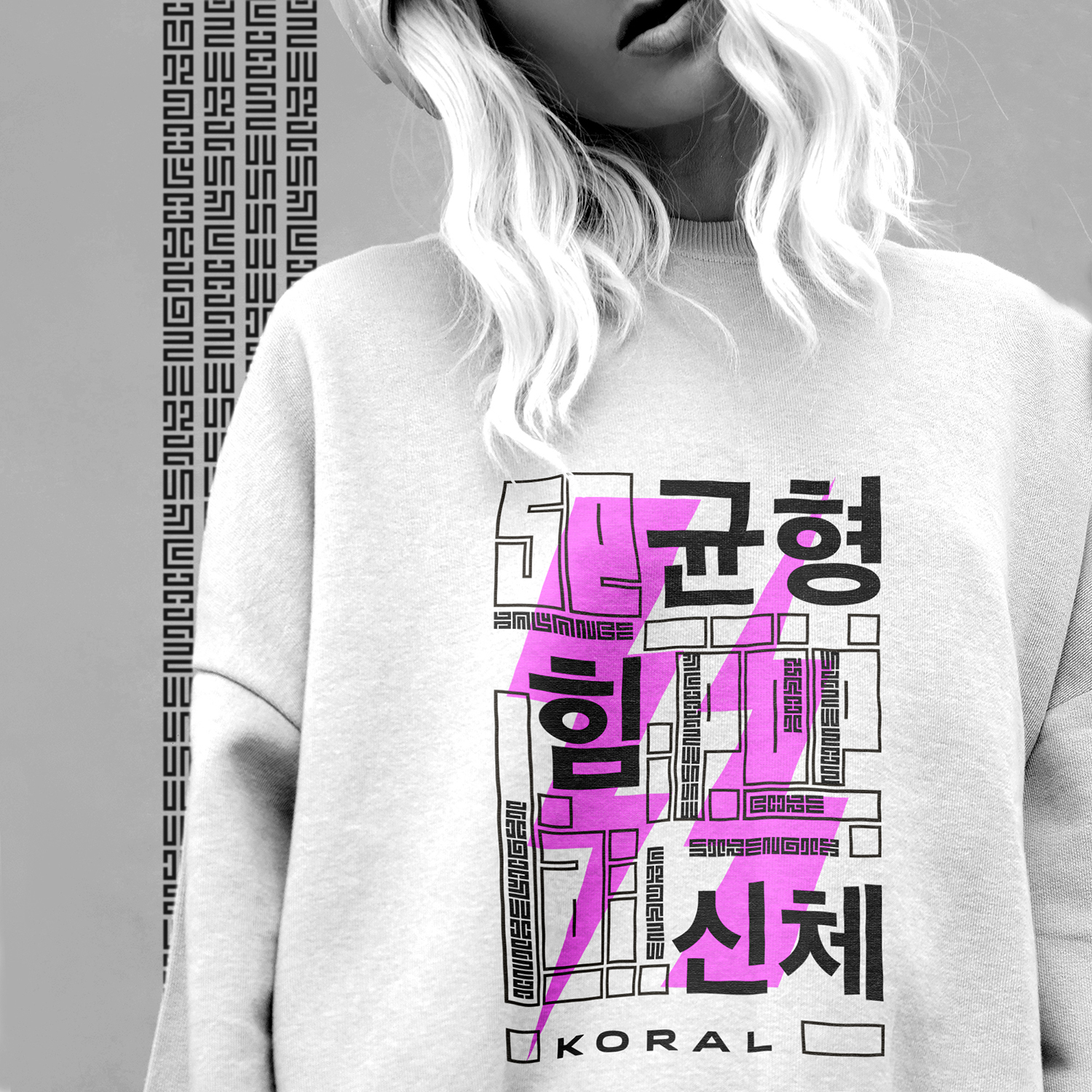
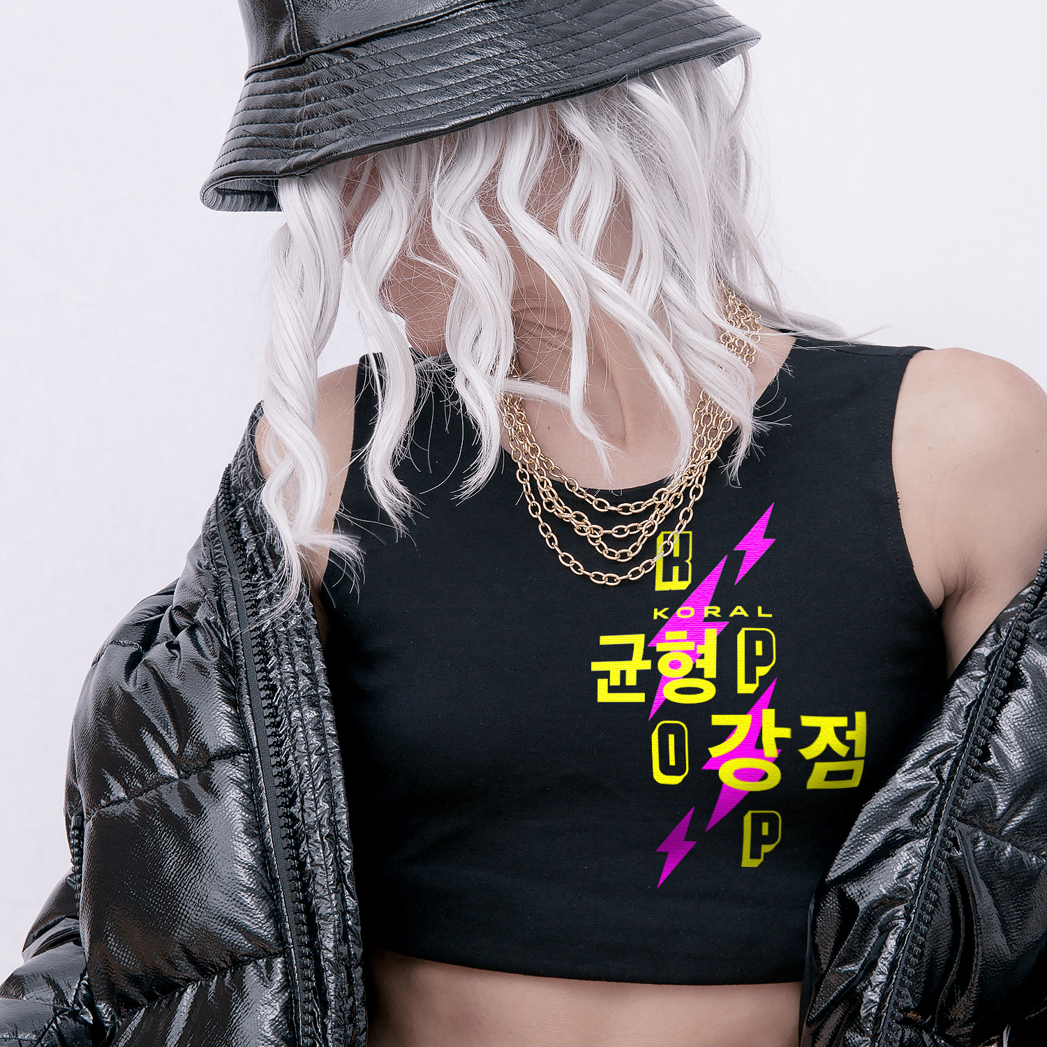
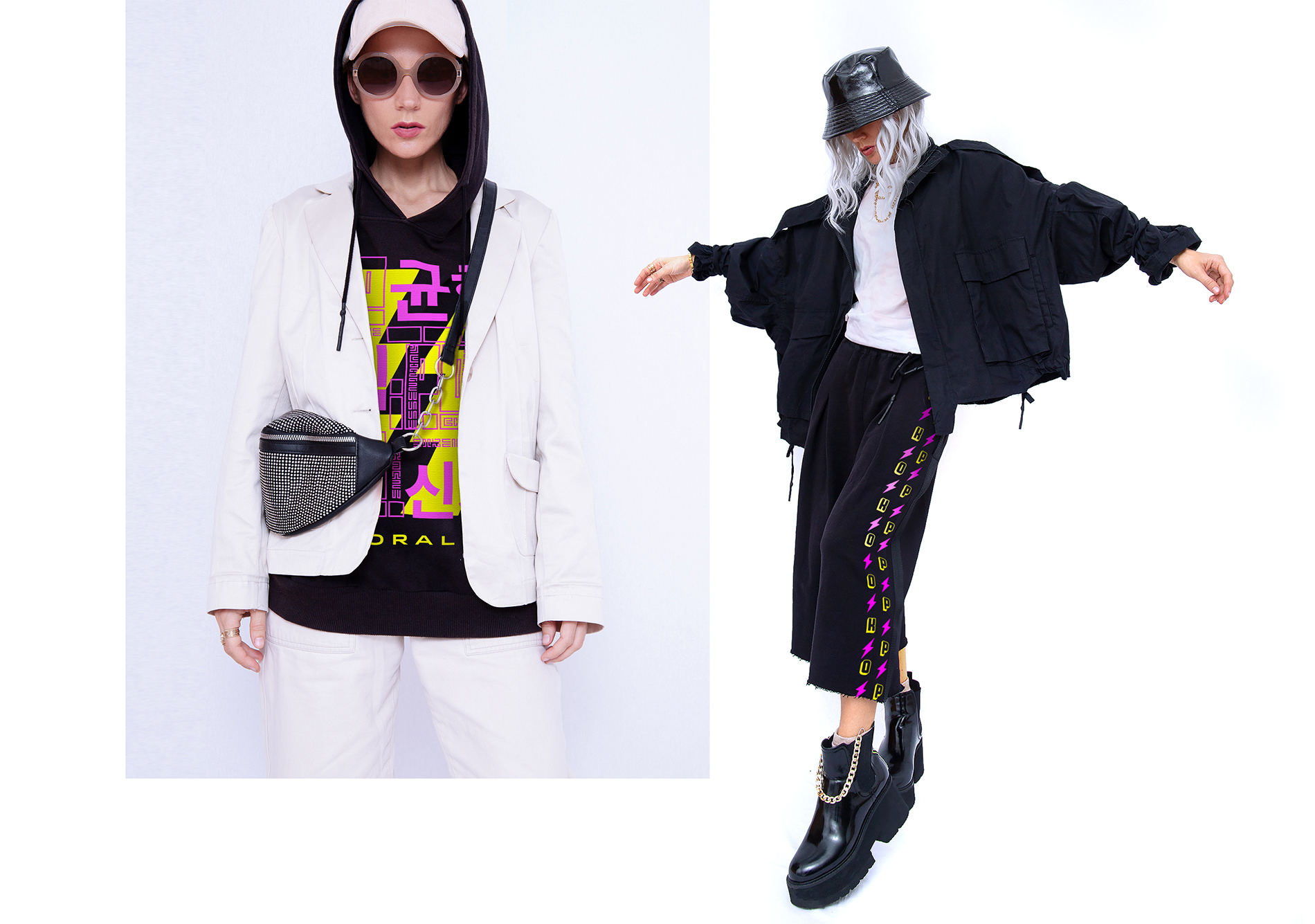
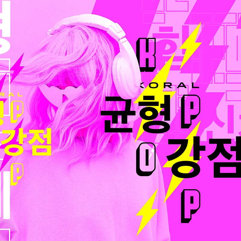
I developed a series of prints for the K-POP athletic clothing collection. I worked in close collaboration with the company’s designers to define the look and feel of the prints and how they are gonna be placed on the product. I used abstract city maps, bold typography, flashing lightning, and neon colors to create striking designs that reflect the bright rebellious futuristic look of K-POP fashion. The hieroglyphs used in the designs mean ‘balance’ and ‘strength’ and refer to the company’s motto – ‘Balance is the essential strength of our core’.
#ff55fb
#ffff00
#000000